Wednesday, 17 February 2016

Technical file: eye shapes and liner.

Todays practical was all about eye shapes and different eye looks. In todays practical created three different looks; a day time look with a simple liner, a night time look with more dramatic liner and a look that related to the current trend from SS16 shows. This was also to teach us the importance of looking at your clients eye shapes, whilst a bold liner will suit one person, this may not be the best for another. 

Tools and products needed for these looks


  • Eyeliner (liquid and pencil and in a range of colours)
  • Mascara 
  • Eyeshadow 
  • Concealer 
  • Eye primer 
  • Brushes (for eyes)
  • Eyelash curler
  • Mascara wands 
Look 1 (Day time look)
  1. Prep the eye by applying an eye base primer 
  2. Conceal the eye if needed 
  3. Apply a shadow that is natural to the clients skin tone.
  4. Apply a little darker shadow in the darker colour (not too dark)
  5. Starting from the outside draw a straight thin line with the liner in a diagonal shape upwards from the eye. 
  6. Then go to the inner corner of the eye and draw a line following the lash line, joining it up to the line you have previously made. 
  7. Curl the eyelashes.
  8. Apply mascara to the bottom and top lashes.
Here is the outcome of this process. 


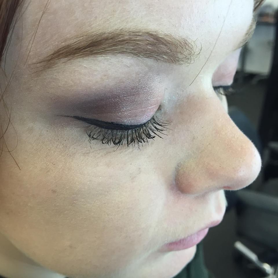
Look 2 (Night time look)
  1. Prep the eye with an eye base primer.
  2. Conceal the eye if needed. 
  3. Apply a shadow that is natural to the clients skin tone.
  4. Apply a darker shadow in the crease of the eye.
  5. Apply a shimmery shadow to the eye socket. 
  6. Starting from the outside draw a straight line with the liner in a diagonal shape upwards from the eye, this can be as thick as you like.
  7. Then go to the corner of the eye and draw a line following the lash line, again this can be as thick as you would like.
  8. Curl the eyelashes.
  9. Apply mascara to the bottom and top lashes.
Steps 3,4 and 5 are optional, you can create the eye look as dramatic as you want.

Here is the outcome of this process.


Look 3 (SS16 trend)

The look I chose to follow was a bold liner in the colour blue, as this was trend kept cropping up again and again. I decided to change the look a little by applying a blue shadow to the inner corner of the bottom of the eye. 

Here are the steps for this process;
  1. Prime the eye with an eye base primer.
  2. Conceal the eye if needed.
  3. using the blue eyeliner follow the steps from the previous looks, however this look is supposed to be very bold so the line can be very thick and sharp.
  4. Taking a blue eyeshadow apply this to the inner corner of the eye.
Here is the outcome of this process. 


Tuesday, 16 February 2016

Technical File: Adding accessories to hair.

This weeks practical was all about adding accessories to the hair. This technique is good to know when it comes to the style and era your design is for, for example if you were creating a 1920's look, adding feathers to the hair will give it this feel. Also this was a very useful technique to know as now I would be able to create a basic style for weddings/proms/formal events.

The up do hairstyle that was used as the base for our accessories was a chignon. This was because it was simple to complete, yet is very diverse in the way that you are able to dress the hair up.Here are the steps to complete a chignon.

  1. Brush the hair through with a paddle brush.
  2. Section the hair so that there are medium sections left around the sides of the head.
  3. Take the rest of the hair and put in a pony tail close to the neck of the client. 
  4. Taking the pony tail, roll the hair up and pin in place (it should look a little like a sausage).
  5. Using more clips make sure the chignon is bought round and there are no gaps between the hair and each end.
  6. with the remaining hair you can place it where ever you would like, for example you might want to plait it or just bring it round.
  7. Then place your accessories in the hair as you would like.
  8. Finish up with some hair spray and shine spray.
Health and Safety for this:
  • Make sure you wash your hands before you touch your client. 
  • If you use heat tools be careful not to burn your client.
  • When using shine and hair spray make sure you do not get it in your clients face. 
Tools needed:
  • Paddle brush 
  • Pin tail comb
  • Hair accessories 
  • Hair bands 
  • Hair clips 
  • Hair spray/shine spray 
  • Heat tools (if needed).
Here is my hair designs.

Here is the initial chignon:


The first design I went for was very boho. It featured plaits and little hair accessories.


The second design I went for was more formal, it featured a white necklace. 


 Analysis:
I was really happy with my first attempt at this hairstyle, I think both designs worked well and both looked different which is what I was going for. I also really liked the process of this practical as I enjoyed the process of adding the accessories to the hair and getting creative with the hair. I believe this process has also given me a lot of ideas for future shoots as the designing process is wide open.


Friday, 12 February 2016

The ethos of Chanel; what makes it a successful brand?

What makes Chanel a successful brand?

When looking into how Chanel has become successful the overall verdict was that the brand conveyed modernity to the masses whilst still taking inspiration and ideas from artistic movements from the past. An example of this would be their video advertising 'Rouge Allure' lipsticks. This video makes reference to the Dadist photographer Erwin Blumenfeld, who shot the iconic cover for Vogue Magazine that the advertisement copies. This proves that Coco Chanel related and collaborated her brand to what was going on at the time such as; surrealism, Dadism and Cubism to sell her products. 
Here is the video.


Unlike most cosmetic advertising that focuses on photoshopping the images, this Chanel advertisement references to avant-garde movements and fashion identity to sell the lipsticks.
Chanel realised that these movements related to social change and trends, by marketing the products in this way would increase there popularity.

Parisian references.
An element Chanel uses that can be seen as making them a successful brand would be that ever since the beginning they have used constant Persian references within their designs and advertising, thus cementing the brands heritage. This is a successful branding technique as consumers will feel like they know the brand, they may even feel like they know Coco Chanel as they are consuming Parisian details within everything they buy from Chanel. This also offers consumers who like the idea of travelling a slice of the Parisian lifestyle and identity.
It could be said that this makes Chanel a successful brand as by having consistency within their products, consumers feel as though they know what to expect from the brand and portrays the brand as being reliable.

Success in packaging and design.
Another element that makes Chanel a successful brand would be packaging and design. The brand has close links with all the producers of their packaging, this means that the likes of Lagerfeld and executives of Chanel make decisions the whole way through the making of a product and therefore the outcome will be what they are wanting. Furthermore this means that because they have such a good relationship with the small number of manufacturers they have control over every aspect, they have kept the manufacturing small and in the same place, therefore reducing the amount of things that can go wrong with packaging and manufacturing.
''Chanel packaging department operates under a kind of motto: "We have one product for one world." - Michel Dupuis, senior v.p. of package development in the Paris headquarters. (packagedesignmag.com)

The Chanel experience.
Chanel is successful as the brand creates an experience for it's consumers.


Thursday, 11 February 2016

In class presentation: Brief introduction to my chosen brand.


My chosen brand from Adi Marsh

Here is the in class presentation we had to produce. This powerpoint briefly describes Chanel as a brand and the SS16 collection titled 'L.A Sunrise'. Producing this powerpoint has given me an insight into the brand and has given me some ideas about what products I would like to produce advertising looks for and the type of catwalk look I would like to design. 

Monday, 8 February 2016

Technical file: 50's, 60's and 70's hair using rollers

Todays practical was all about dressing the hair and looking at how setting the hair affects the overall outcome. We were given the option to recreate 50's 60's and 70's inspired looks using rollers. 

50's hair:
50's hair usually uses tighter curls and is often then used to create an up do, this would include rolls on the top of the head.
60's hair:
60's hair was all about the volume, the hair was often a looser more natural curl and often and if the hair was dressed up this would usually be a half up, half down look with the volume all on the top layers. 
70's hair:
70's hair was also had plenty of volume, however the difference between 60's and 70's hair was that 70's hair was not usually brushed through after curling. Another style would be to curl the hair outwards from the face, again giving the hair a big bouncy effect. 

Tools needed for this look.

  • Sectioning comb. 
  • Paddle brush. 
  • Heated rollers (you may need more than one set depending on the thickness of the hair)
  • Hair spray 
  • Heat protection 
  • Shine spray (optional)
  • Hair bands if you will be creating an up do.
Health and safety for this:
Make sure you have washed your hands before touching your clients hair.
Make sure you complete a consultation before starting.
Be careful with the heated rollers as these will be very hot.
Do not spray products in your clients face or eyes. 
Be careful not to burn your clients head with the rollers. 

For this process I decided to create a 60's inspired look as I thought this would work the best on my client as she had a full fringe.

Steps to complete this look:
  1. Prep the hair by applying heat protection. 
  2. Section the hair two side sections, a middle section and more side section (the bottom section will be used for brick work)
  3. Take medium rollers and apply them to the side sections going down, make sure you take the hair in an under movement when rolling it as this will add lift to the roots of the hair.
  4. Take the middle section of the hair and apply large rollers using the same technique.
  5. After this use the brick work technique on the left and right hand sides. 
  6. Leave the rollers in until they are cool.
  7. After this remove the rollers but do not brush the hair through.
  8. Once all the rollers have been removed begin brushing the hair through with a paddle brush. Brush the hair under and over holding onto the hair as this will allow you to control it and shape it to your look. 
  9. Seeing as this was a 60's look take the sectioning comb and backcomb at the roots to add even more volume. 
  10. Finally spray with hair spray, and shine spray to complete the look. 
Here is the what the rollers should look like 


Here is the final outcome of this look:


Evaluation:
I believe the outcome of this look was successful. This is because you can see the volume that the hair has and I like the way the curls look. To improve this look I believe the application of the rollers could have been better as this would have given even more volume to the hair, however I think this is a mixture of my sectioning needing to be improved and the fact that I was overly cautious with not burning my clients head with the rollers. For my second attempt at using rollers I believe this has been successful and will definitely look at improving this technique as it is something I enjoy doing. 


Technical file: Contouring

Contouring is used to sculpt the face, contouring can be used in advertising to slim the face down, and in catwalk looks that can range from natural contouring to contouring using different colours. 
We were given the choice in our practical session to choose between creating natural contour or contour that would fit a more editorial or catwalk look, I decided to go with natural. 

Health and Safety:
Make sure your hands are washed before touching your clients skin. 
Place a gown on your client to avoid products dropping.
Make sure to complete a consultation before starting.
Make sure all brushes are clean before going from one client to the next.


Tools needed:


  • Skin care products (moisturiser, cleanser and toner)
  • Primer 
  • Foundation to match skin tone and a couple of shades lighter and darker then the clients skin tone
  • Concealers
  • highlighters (powders and creams) 
  • Setting powder 
  • Bronzer 
  • Blusher 
  • Makeup brushes 
Steps to complete this look:

  1. Prep the skin by cleansing, toning and moisturising. 
  2. After this add primer to the skin, depending on if you are going for a dewy glow or simply sculpting the face it may be worth using a primer to suit this.
  3. Colour match your clients skin tone to the correct foundation.
  4. After this apply foundation all over the face, blending well.
  5. Take a foundation/concealer that is a couple of shades darker than the natural skin tone and place this in the areas of the face that you require shadow. (This is usually the hollows of the cheeks, the forehead, under the chin and sometimes the bridge of the nose)
  6. Blend this so that it looks seamless.
  7. Take a concealer that is a shade lighter than the skins natural tone and apply this to the areas of the face that require light. (This is usually the front of the forehead, the cheekbones, the chin, the bridge and tip of the nose, the cupids bow and the eyebrow bone. 
  8. Blend this so it looks seamless
  9. After this apply a cream highlighter to these areas too, be careful not to go in with too much product as if you require more for the look you can build it up.
  10. After this apply a setting powder to the areas that can be oily, such as the T-zone area.
  11. Then go in with the bronzer and lightly go over the areas of the face that you shaded.
  12. After this go in with a powder highlighter and go over the areas of the face that you have added light too. 
  13. Steps 11 and 12 are optional if you require a more dewy natural contour.
  14. Set the makeup with a setting spray, this may also make the skin more dewy looking.
Here is the outcome of my natural contouring:


I believe the images of this do not reflect truly what the outcome of this look was, I should have used the flash as this would have picked up the highlight on the face and would be a better representation of my work. In reflection if I get the time I will go back and create this again and take more pictures. However, I liked the fact that you could see the highlight and this made the face look golden and glowing, I also thought the contouring was successful as you could really see the depth in the face. 
I would also like to create a more catwalk/editorial look as this would allow me to practise contouring further, it would also be worth looking to recreate this process on different face shapes.

Monday, 1 February 2016

Photography technical file: Lighting

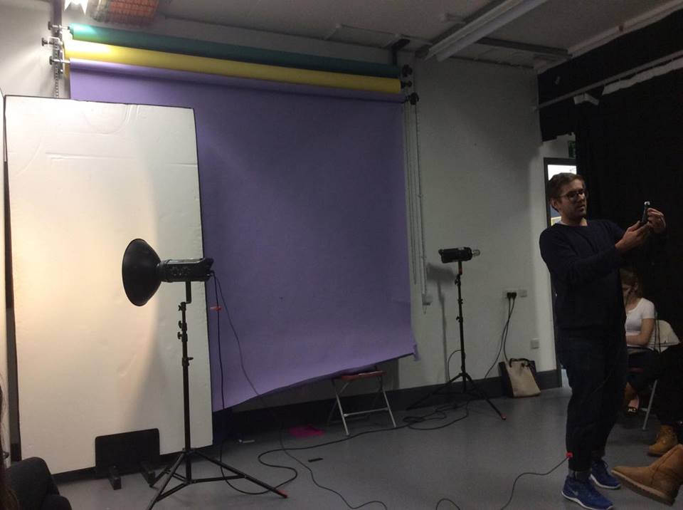
During this practical we focused on exploring the different ways we are able to light a picture in the studio.
Beauty lighting includes;

  • The beauty dish
  • Soft box 
  • Bounce lighting 
When shooting it is worth measuring the light with a light meter this will allow you to programme the camera to the correct aperture/exposure and the lights to the correct brightness. To measure the light connect to the flash head with a sync lead. To measure the lighting, press the power button 4 times so that it is on the setting 'flash C' so that it works with the sync lead, hold the light meter next to the model and press the button to make the flash go off, the number represented on the screen will be the number your camera needs to be on to achieve the best lighting. Always remember that if the relationship between the model and the lights changes then you will need to produce another reading. 


Depth of field when shooting. The depth of field refers to the amount of light that is being let through, this means what the camera will focus on. The higher the number the greater the detail so for example, if you were using a background in the studio a high depth of field will show any creases in the background whereas a lower number will give a softer look. Numbers such as 11,16 or 22 will show a lot of detail in the images, to turn the depth of field down simply turn the flash down on the flash head.

Remember that the bulb in the flash head is the modelling lamp and stays lit so that you are able to see any shadows on the model before you take the picture, whereas the the flash tube does not. The way that you can tell this is working is with the green light on the side. If this is off then there may be a problem with the flash tube.

HEALTH AND SAFETY TIPS:
  • The flash head points up on the light stand.
  • Make sure that you take the cap off of the flash head as if you do not and turn it on the cap will melt and catch fire.
  • The flash tube is very expensive so try and be careful not to break it.
  • Make sure the dishes are clicked into the flash head properly as if not they will fall off. 
  • When attaching a soft box it may be worth taking the flash head off and putting the soft box on before putting on the stand as they can be very big and tricky to place on the flash head. 


Here is the image using the beauty dish:


SOFT BOX: 
Using a soft box will disperse light as it is a bigger canvas. The soft box will give the look of a cloudy day and being outside this means the outcome can be more natural looking than by just using the beauty dish. Here is the image from using the soft box:


BOUNCE LIGHT:
Bounce lighting refers to light bouncing off white backgrounds and can be used to save space as it makes the area look bigger, often bigger than any soft box. To produce this you will need to point the light against the corner of the white backgrounds and stand your model diagonal to this, you can also use a reflector to add even more light to your model.


Here are the images using bounce lighting, the first is without the reflector the second with:


ANALYSIS: Out of all the images I preferred the soft box. This was because it gave the skin an over all glow and was much more complementary than the others, I also felt that using the reflector put too much light on the subject therefore I would probably not use this technique. Furthermore I preferred the soft box as I thought the other images were a little harsh and bright as opposed to being soft, however preference would depend on the look I am going to be creating.