The backdrop.
I am planning to use a coloured backdrop for my editorial, the colours I am thinking will be either pink, yellow, blue or orange as these are colours that remind me of spring/summer time and hot weather. I feel as though I will probably go for a pink background as the jacket I have sourced for the editorial has pink in it and this will make the image congruent. I am going to experiment with the background, one being plain as this I feel will not take away from the model and collection and one with the Chanel logo on it as this I feel would be a nice touch and add something to the image. often Chanel incorporates the logo in their advertisements and editorials as this cements the brand name in the viewers minds. I think that adding the logo is also quite playful, which is a theme throughout Chanel editorials.
Here is an example of the type of background I will like to use
Shahid, S. (2015). Lily Collins smoulders in colourful knitwear as she poses for Karl Lagerfeld in new campaign Read more: http://www.dailymail.co.uk/tvshowbiz/article-2921834/Lily-Collins-smoulders-colourful-knitwear-. Available: http://www.dailymail.co.uk/tvshowbiz/article-2921834/Lily-Collins-smoulders-colourful-knitwear-poses-Karl-Lagerfeld-new-campaign.html. Last accessed 19th April 2015.
This image comes from a Chanel editorial featuring Lily Collins as she became the new face of the brand.
The lighting.Throughout my shoot I will use the beauty lighting we have been taught, as I feel this gives the images a professional feel and compliments the skin nicely. I will also try and take images using a gel, the colour will probably be a red. I will do this as I feel it relates to the current Chanel SS16 makeup collection. I feel the gel lighting will look different for an editorial as fashion editorials to me are all about the whole image, they are about enticing the viewer and making them enjoy the images and article they may be reading. I also feel that using the gel lighting will be an interesting was to represent spring/summer with the bright colours gel lighting offers. The editorial will be brightly lit as this is something I have noticed is often the case with editorials.
Here is an example of the lighting I will use.
I have chosen this lighting as I like the way the model is the main focus of the image, furthermore I like the way the shadow has been cast against the background as this makes the model look strong.
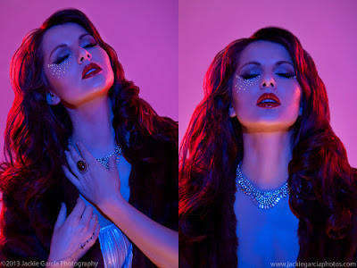
Here is an example of the lighting I will experiment with.
O'keeffe, D . (2015). Clothes Show Final Images. Available: https://deanokeeffe96.wordpress.com/category/uncategorized/page/5/. Last accessed 19th April 2016.
This lighting looks a little cool for my liking, when I experiment I will aim for all of the light to be red and not mixed with any blue. I will also aim for the images to be a little brighter as this image looks a little too dark.
Here I have drawn a diagram on how I will set up the lighting for my editorial look.
I would like the light to hit the model nicely and give her an naturally looking soft skin look, this is why I have gone for the bounce lighting. I have also drawn where I will place the lights for the gel, I want the gel colour to hit the model on the side of her face as this I think will then look like the sun is shining on her.


No comments:
Post a Comment