Tuesday, 19 April 2016

Planning my editorial

I have decided to create an editorial that will consist of more full length images and will feature the clothing, as opposed to editorial images that are close up shots of makeup. Creating a collection of images around Chanel means that I am able to do this as Chanel is a fashion brand as well as a beauty brand. With my editorial shoot I wanted to capture something bright as the editorial will be for spring/summer.

The backdrop.
I am planning to use a coloured backdrop for my editorial, the colours I am thinking will be either pink, yellow, blue or orange as these are colours that remind me of spring/summer time and hot weather. I feel as though I will probably go for a pink background as the jacket I have sourced for the editorial has pink in it and this will make the image congruent. I am going to experiment with the background, one being plain as this I feel will not take away from the model and collection and one with the Chanel logo on it as this I feel would be a nice touch and add something to the image. often Chanel incorporates the logo in their advertisements and editorials as this cements the brand name in the viewers minds. I think that adding the logo is also quite playful, which is a theme throughout Chanel editorials.
Here is an example of the type of background I will like to use
Shahid, S. (2015). Lily Collins smoulders in colourful knitwear as she poses for Karl Lagerfeld in new campaign Read more: http://www.dailymail.co.uk/tvshowbiz/article-2921834/Lily-Collins-smoulders-colourful-knitwear-. Available: http://www.dailymail.co.uk/tvshowbiz/article-2921834/Lily-Collins-smoulders-colourful-knitwear-poses-Karl-Lagerfeld-new-campaign.html. Last accessed 19th April 2015.

This image comes from a Chanel editorial featuring Lily Collins as she became the new face of the brand. 
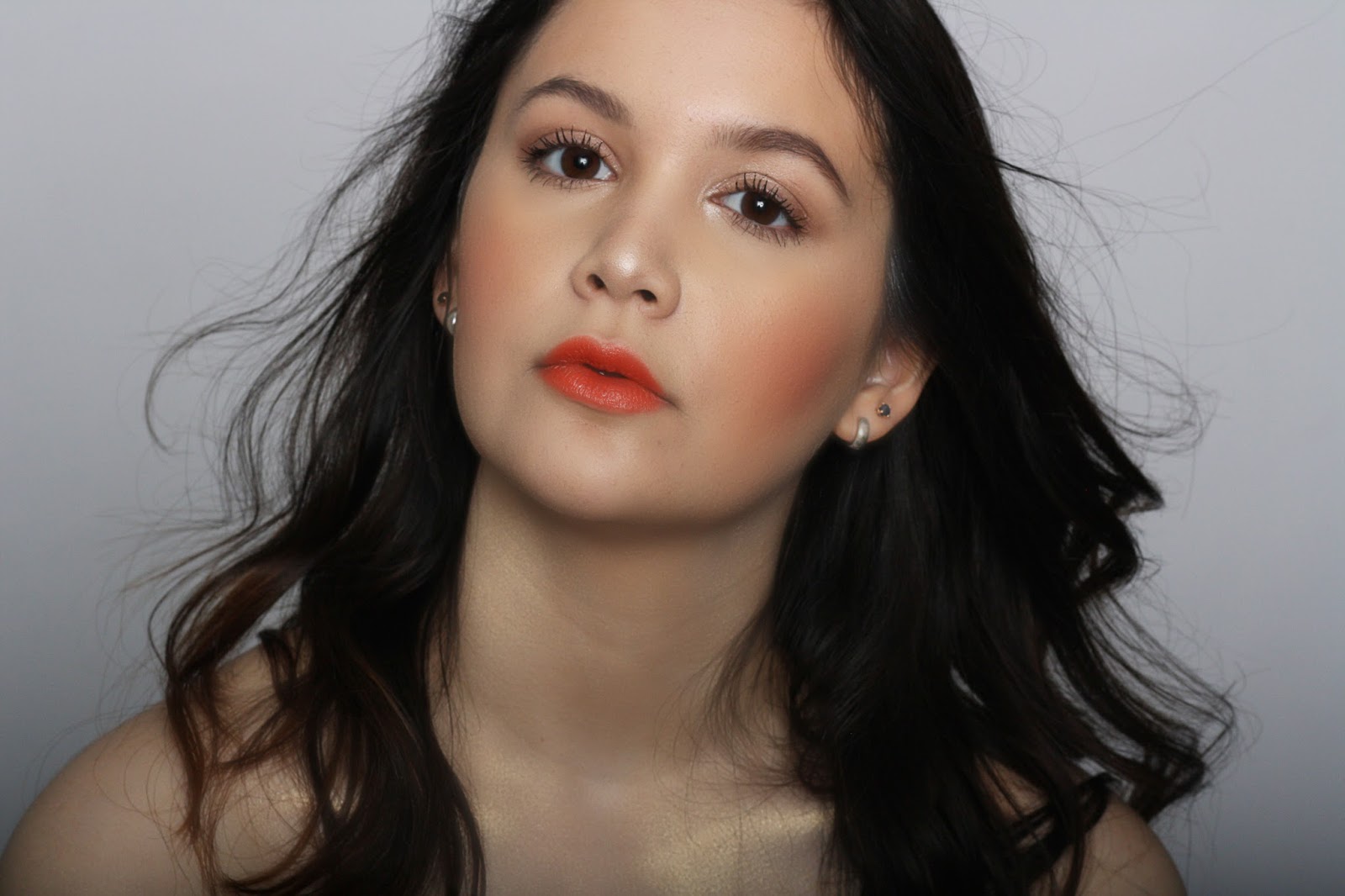
The lighting.
Throughout my shoot I will use the beauty lighting we have been taught, as I feel this gives the images a professional feel and compliments the skin nicely. I will also try and take images using a gel, the colour will probably be a red. I will do this as I feel it relates to the current Chanel SS16 makeup collection. I feel the gel lighting will look different for an editorial as fashion editorials to me are all about the whole image, they are about enticing the viewer and making them enjoy the images and article they may be reading. I also feel that using the gel lighting will be an interesting was to represent spring/summer with the bright colours gel lighting offers. The editorial will be brightly lit as this is something I have noticed is often the case with editorials.

Here is an example of the lighting I will use.

 I have chosen this lighting as I like the way the model is the main focus of the image, furthermore I like the way the shadow has been cast against the background as this makes the model look strong.

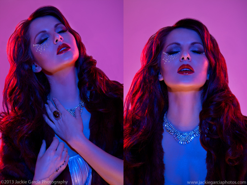
Here is an example of the lighting I will experiment with. 
O'keeffe, D . (2015). Clothes Show Final Images. Available: https://deanokeeffe96.wordpress.com/category/uncategorized/page/5/. Last accessed 19th April 2016.

This lighting looks a little cool for my liking, when I experiment I will aim for all of the light to be red and not mixed with any blue. I will also aim for the images to be a little brighter as this image looks a little too dark. 

Here I have drawn a diagram on how I will set up the lighting for my editorial look.
I would like the light to hit the model nicely and give her an naturally looking soft skin look, this is why I have gone for the bounce lighting. I have also drawn where I will place the lights for the gel, I want the gel colour to hit the model on the side of her face as this I think will then look like the sun is shining on her.


Planning my editorial: Face and hair charts.


Here are my face charts for my editorial looks. The first look will feature a pink lip and smokey eyes. I want the base to be quite minimal with a little blush, although in the face chart the blush has come out a little stronger than I would have liked. The second look will feature an orange lip as these colours relate to my other images, the advertising has been a lipstick in orange and the catwalk looks featured pink lips. I want the main focus to be on the lips for my editorials as this is the main thing I will be changing for both looks, the models will also be wearing sunglasses and this means that you may not be able to see the makeup on the eyes.


Here are my charts and design notes for the hair for my editorial looks, as you can see I have written how the hair will represent Chanel and SS16. 

Monday, 18 April 2016

Planning my editorial look: The styling.

I decided to go looking to source the clothing and accessories for my editorial looks. I wanted to focus on the whole image, and produce some full length pictures as I felt this would reflect a Chanel editorial the best. Keeping in mind that I need the styling to reflect SS16 the clothing would need to be able to be worn in the spring or summer, this meant that I did not want the clothing to be too heavy, however I still wanted to feature a tweed jacket or cardigan type items.
I also want to feature some sunglasses in the images as I feel this item reflects summer very well. I chose to buy them in white as this is a colour associated with the brand. Finally another item I was looking for would be pearls as they are highly associated with the brand Chanel.

I found a jacket for the first look and a cardigan for the second look. The jacket was tweed looking and was brown, beige with a hint of pink in it. This was perfect for the shoot as I was planning on having a pink background, this would be another element to make the pictures look congruent and from the same theme. With the cardigan it was white and black and not too heavy, an element that I wanted to incorporate as I was keeping in mind that the styling would still have to fit the SS16 brief. The shoes I found were silver, this is something I wanted to focus on as the existing SS16 Chanel collection on the runway featured a lot of silver and in particular silver shoes, this was something I wanted to recreate for my editorial looks to reflect the existing Chanel collection. With the dresses I wanted them to be simple and black, I also wanted them to be body con as I felt this would fit with the jackets better. Finally the dresses I purchased would be mid length and the model would have her legs out as this I feel would reflect that the clothing was for the warmer weather. I did not want the model to be head to toe in clothing such as the jackets and trousers as I felt this would not look very SS16.

Here are some Chanel styled images that I have gathered inspiration from for my own editorial shoots.

Bologna, D . (2016). Summer in Chanel. Available: http://www.dariobologna.com/portfolio/summer-in-chanel/. Last accessed 20th April 2016.
Here is a summer editorial by Chanel. I have taken inspiration from this with the jacket as the one I purchased was quite similar looking.

Staff. (2013). Chanel eyewear campaign 2013. Available: http://ftape.com/media/?p=59002. Last accessed 20th April 2016.
Here I have taken inspiration from this image for the sunglasses again the item I purchased was very similar looking to these sunglasses.

Michele, K . (2016). Chanel ad campain.. Available: https://uk.pinterest.com/pin/341992165434927594/. Last accessed 20th April 2016.
Here is the existing Chanel SS16 editorial, the inspiration I have taken from this would be the silver shoes and the sunglasses. These are both something I will feature in my own recreation of the editorials. 

Sunday, 17 April 2016

Experimenting with different advertisements.


Shooting my advertising day look:


Here are some of my favourite images from shooting my advertising day looks. I decided that I would take inspiration from the current Chanel SS16 L.A Sunrise collection and have the models hair blowing in the wind, this is something I think worked well in the pictures as this have them a free and natural feeling. Taking inspiration from the collection I have created a look to have a bright blush and lipstick. When looking into the collection there was an orangey/coral lipstick that I liked and therefore used within my advertisement look. Also in the collection there was a blush/illuminating powder that I liked and therefore have made the models skin very glowy and have used a blush on the cheeks. To be on the safe side as I do not know exactly what product I will use in my final advertisement, I then changed the look to have more natural looking makeup as although the foundation was not part of the current SS16 collection, it is one of Chanel's best selling products and if the brief allows me to advertise this product I will probably go with that one. With the skin I wanted to present a glow from being in the sun as the collection is called L.A Sunrise, this means I have applied a lot of highlighter to the face and to the collar bones to make them stand out and feel glowy. I am happy with the outcome of these images, however I would have liked to have used the same gel lighting as Chanel had, however I was unable to change the background and had to stick with the grey that they had available. My next step would be to see if I can create the same effect as the collection with editing, if this is not possible I will look to shoot the images again, although overall I am happy with the outcome. 

Saturday, 16 April 2016

Technical File: Silhouettes, pony tail and twist.

This week we learnt how to create classic shapes and silhouettes.

Health and safety.
Wash your hands before touching the clients skin/hair.
Place an apron on your client to protect clothing.
If using heat tools be careful not to burn your client.
If using sprays be careful not to spray products on your clients face (particularly the eyes)
Make sure you take consultation notes before starting as this will tell you of any allergies the client may have.

Tools needed for this process.
Paddle brush.
Spray bottle.
Pin tail comb.
Hair clips.

Steps to complete the pony tail look:

1) Begin with brushing through the hair. (You may need to wet the hair down in order to not have any stray bits of hair sticking out)
2) split the hair into a bottom and top section.
3) The top section should be in a triangle shape.
4) Clip the top section out of the way as you do not need it yet.
5) Taking the bottom section brush it into a pony tail, you may need to use both hands if your client has long hair.
6) Taking the top section, brush this to fit with the rest of the hair you can take the section of hair and wrap around the hairband as this will disguise it giving you a professional look.
With this look you can also take the top section and backcomb it as this will give you a raised, quiff type look.

Here is the outcome of this process.


The second technique we learnt was the French twist.

Steps to complete this look.
1) Begin by brushing through the hair.
2) Brush all the hair to one side.
3) Taking clips secure the hair by placing the clips in a line towards the top of the head. (see image below.


4) Using your hands to move the hair, fold the hair over itself towards the clips.
5) Keep twisting the hair, it will look like a roll at first.
6) Once the hair has been twisted and you cannot see the clips, take some more clips and secure the hair into place.
7) Finish off with a little hairspray in order for the look to hold.

Here is the outcome of this process.


Friday, 15 April 2016

The Chanel SS16 makeup collection.


Chanel has launched their SS16 makeup collection titled 'L.A SUNRISE' here are some of the products that feature in the collection.


Farrell, D . (2016). IN REVIEW: CHANEL SPRING 2016 MAKEUP .Available: http://socialandpersonalweddings.ie/beauty/in-review-chanel-spring-2016-makeup/. Last accessed 16th March 2016.

Tavia . (2016). Chanel L.A. Sunrise Spring 2016 Collection. Available: http://chicprofile.com/chanel-l-a-sunrise-spring-2016-collection. Last accessed 16th March 2016.

HOVHANNISYAN, N . (2016). Chanel LA Sunrise Spring 2016 Makeup Collection. Available: http://www.fashionisers.com/perfumes-makeup/chanel-la-sunrise-spring-2016-makeup/. Last accessed 16th March 2016.

As you can see there are a lot of bright colours, such as the blush, the lipstick and the blues. The blue is a colour to be expected as this was featured a lot in their SS16 catwalk show.  These colours represent summer as they are bright and joyful colours, the blue background of the last image and the eyeshadow reminds me of the water and being by a poolside, corals and pinks are also often a big trend for spring/summer make up looks. The packaging of this collection is typical of Chanel. The brand has not changed the packaging for the collection which I think is nice as it is then recognisable as being from Chanel.


staff. (2016). chanel makeup spring 2016. Available: http://www.polyvore.com/chanel_makeup_spring_2016_la/set?id=180402217. Last accessed 16th March 2016.


staff. (2016). Spring 2016 Collection. Available: http://www.chanel.com/en_US/fragrance-beauty/spring-2016-collection-140346. Last accessed 16th March 2016.
Here is an image used to advertise the collection. The background seems to be of a bright sky and the models hair seems to be blowing in the wind. The wind is something I would like to use in my own day look advertisement as I feel this is a nice touch. The skin looks flawless and glowy, the lighting has been used to showcase the skin as if the sun is hitting it. The styling of the model features colours from the collection with the scarf, I like this however this is not something I would like to use as I then think my advertisement would look too much like a copy of the existing collection. I like the brightness of the lips and the eyes, however this is not something I would have done as I feel they are both over powering and fighting for attention on the face although this has been done to showcase all of the products. I like the pose of the model, she seems to be relaxed and carefree which could be signifying the L.A lifestyle.
staff. (2016). Spring 2016 Collection. Available: http://www.chanel.com/en_US/fragrance-beauty/spring-2016-collection-140346. Last accessed 16th March 2016.
Here is another image used to advertise the collection. I infer that this is the idea of the sunrise on the model when the sun is coming up as the photographer has probably used gels to create this orange/purple hued sky look. I like this however I do not think this image alone could sell the collection as you are focused on the lighting and not the product the image is selling the consumers.


Finally here is a video. This is a step by step guide to creating the 'L.A Sunrise look', the video informs the viewer about the products and how to use them. I really like this idea and think this is a very good way of Chanel linking to their audience and consumers. I think the final look was nice, however would not be something that I would personally go for. Taking inspiration from this I will advertise a bright lipstick and a blush that relates to the ones used in this video. I do not think I will use the blue liner as this is something I have touched on with my catwalk looks and feel that the Chanel products that stem from the catwalk shows are much more subtle.